Designing the founder experience for an African startup discovery platform — from first listing to investor discovery.
Overview
What is Seed?
Seed is a visibility and discovery platform for African startups. Founders list their companies; investors and institutions find, follow and research them.
I owned the founder experience end to end — information architecture, onboarding, the dashboard, the Board, Find Investors and every listing state — and worked with the development team through launch.
Seed doesn’t process investments: payment is a listing subscription, a bookmark is interest, and a document request is just a request. Those boundaries shaped every flow and label.
The problem
No single, credible place to be seen
Founders present their companies through decks, links and introductions scattered across inboxes — with no signal on whether anyone is looking. The brief asked for a founder workspace that turns company information into a profile people can find, trust and follow.
Be found
A complete, credible profile that shows up when investors browse.
Look current
A reason to keep the profile alive after the first listing.
Stay in control
Documents shared on the founder’s terms — never sent without them.
MVP priorities
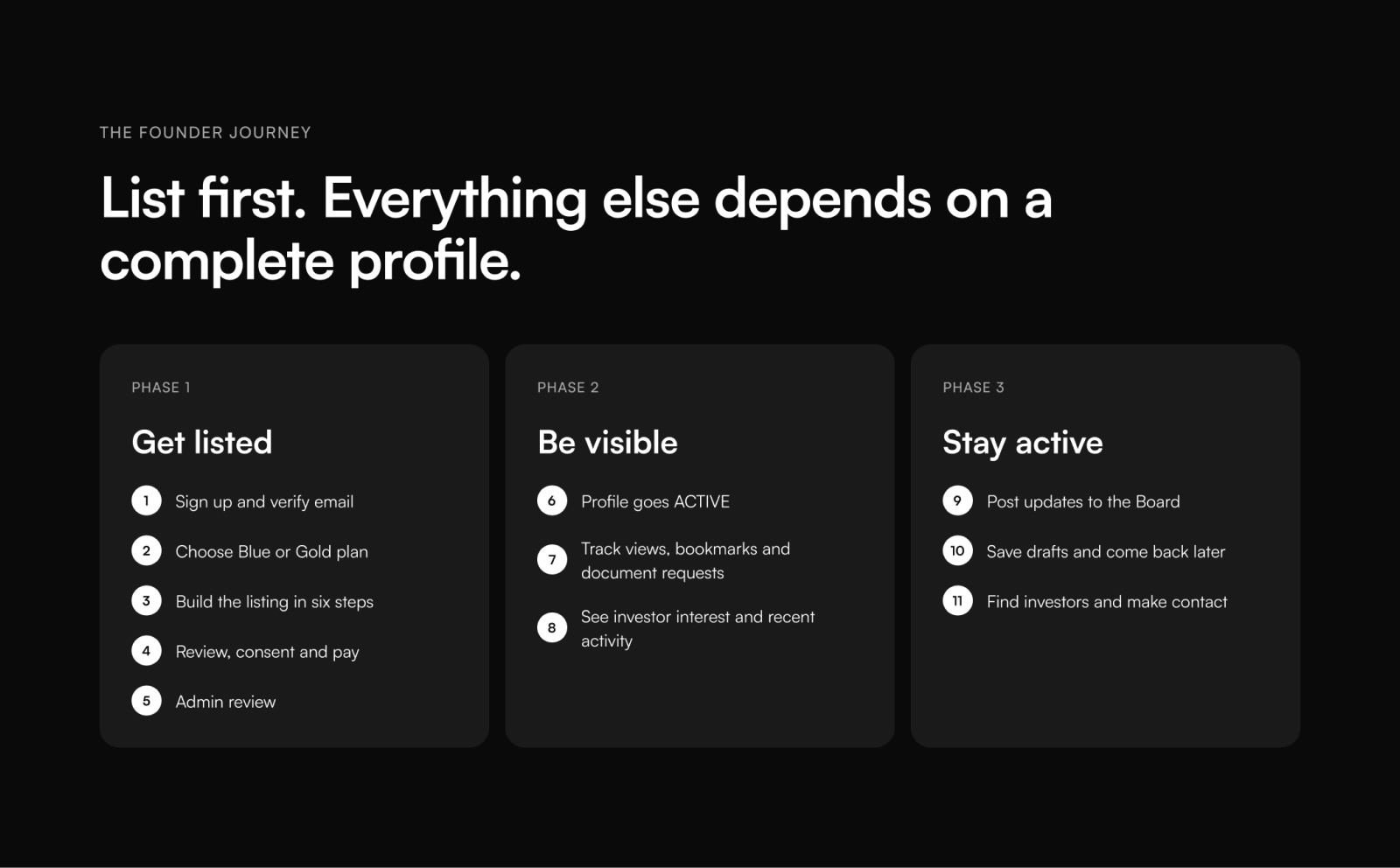
List first. Everything else depends on a complete profile.
Design decisions
Five founder tasks, five screen stories
01 · Onboarding
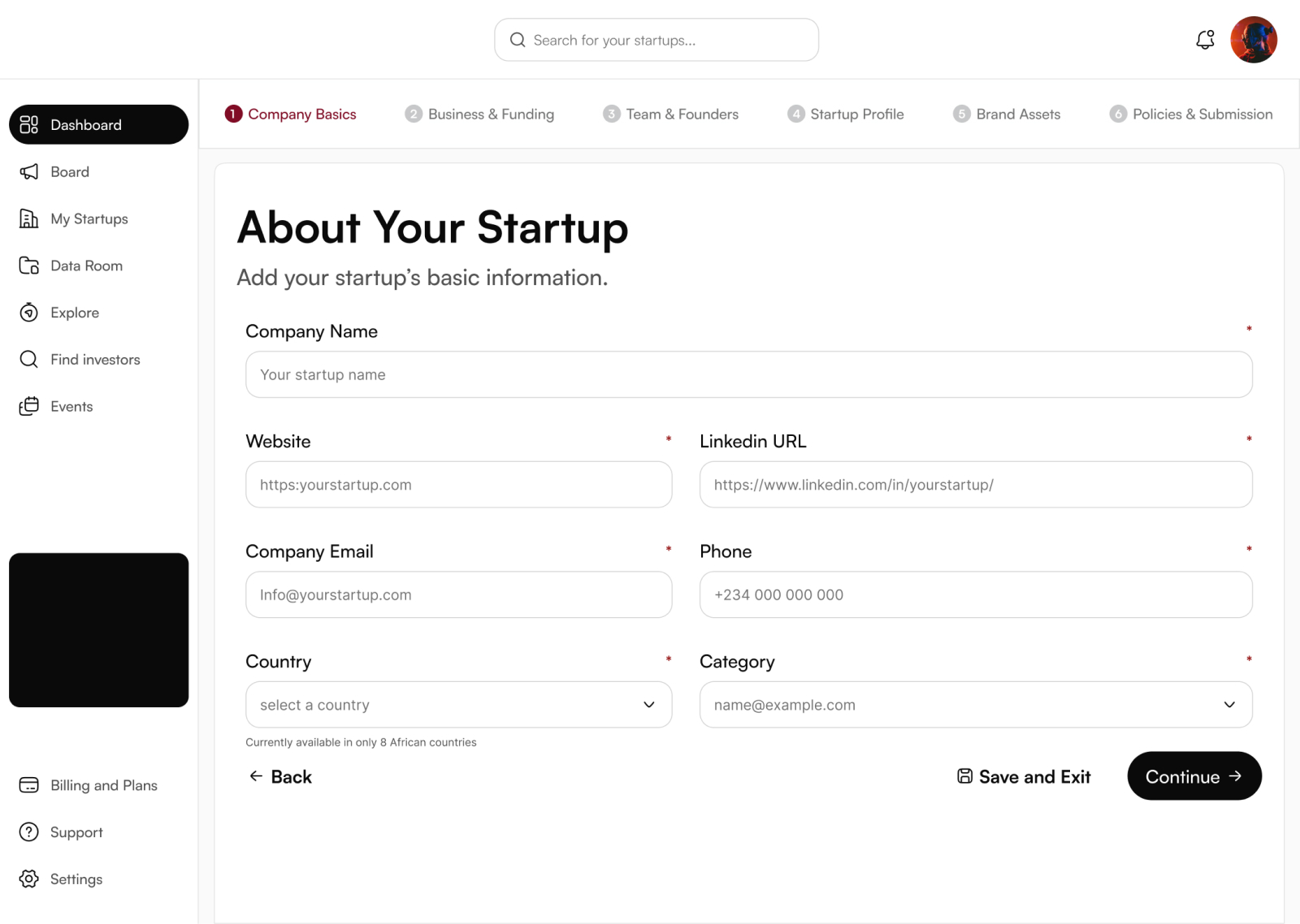
Six steps a founder can actually finish
Plan first, then Company Basics → Business & Funding → Team & Founders → Startup Profile → Brand Assets → Policies & Submission.
- Save and Exit on every step — leaving saves a draft
- Required fields marked; tricky ones get helper text
- Full review and consent before payment
02 · Visibility dashboard
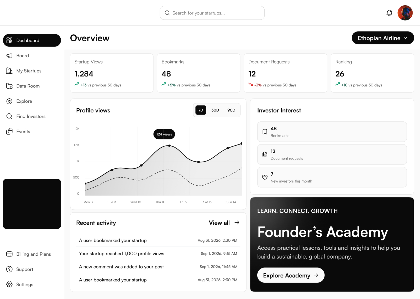
Is anyone finding my startup?
Views, bookmarks and document requests sit up top, each compared with the last 30 days, with profile views over time and recent activity below.
- Bookmarks and document requests kept as separate signals
- One startup at a time, switched from the top right
- An empty state with a single action: Get Started
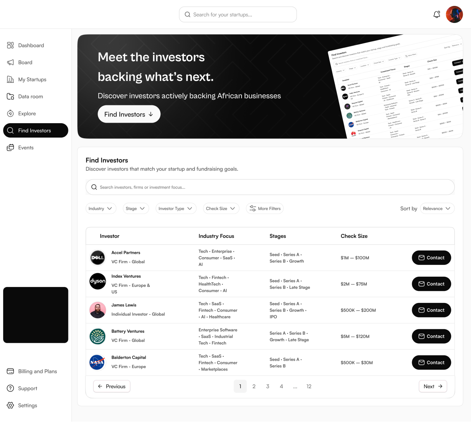
03 · Find Investors
Judging fit before making contact
Filters for industry, stage, investor type and check size, with the same attributes on every row so founders can scan for relevance.
- Profiles add first check, regions and requirements
- Contact opens the founder’s own email
- Find Investors replaced Investor Interest in the nav
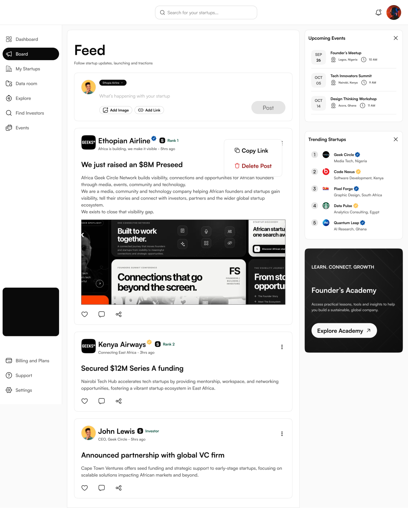
04 · Board
A social space just for startups
Board carries startup news and the updates that keep founders informed — so it moved to the top of the nav, right under Dashboard.
- Post as a startup, with image and link
- Startup identity on every post
- Drafts kept privately for 30 days
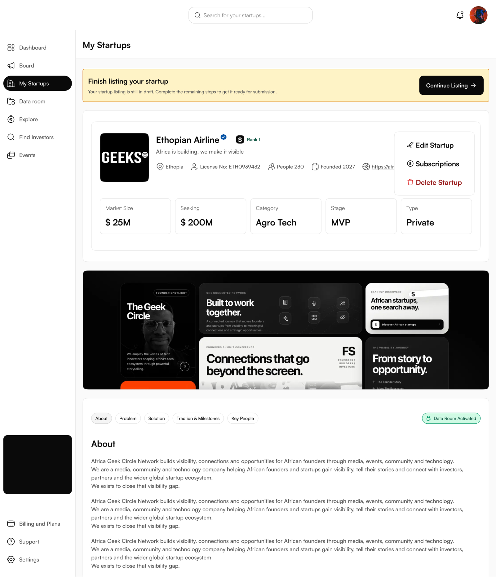
05 · Status
Every listing state gets a banner and one action
Draft → Continue Listing. Expired → Renew Plan. Founders always know where their listing stands before they edit it.
- Banners sit above the profile
- Blue / Gold badges mean paid and reviewed
- Data Room: investors request, founders approve
Launch & results
Live on 30 September 2026
Every designed feature shipped. Next up: tracking where founders drop off and whether they come back — documented in V2.
- 20+new paying founders in the first week
- 53screens designed and shipped
- 8African countries at launch
Reflection
What I’d carry forward
Design every status early
Deciding up front that every listing state gets a banner and one action kept 53 screens consistent and gave engineering a clear rule.
Language is interface
Request documents, stated by the company, listing subscription — the words shaped buttons and empty states as much as layout did.
Let data shorten the form
Next, I’ll use step-level drop-off to simplify whichever onboarding step loses the most founders.